2024
GoTyme Bank

Background
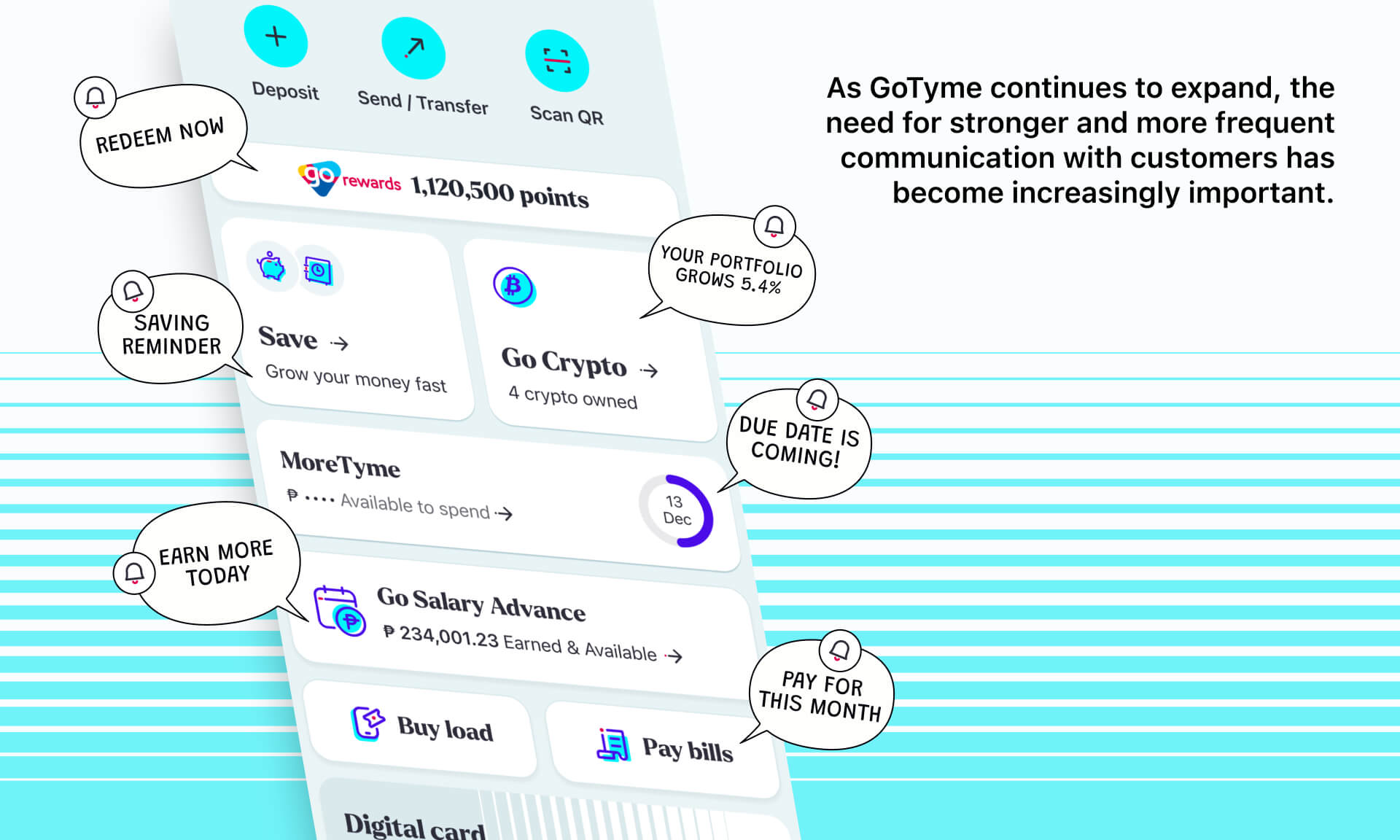
Notifications are more than system alerts, they are key touchpoints to keep users informed and engaged. A centralized Notification Center serves as a single destination where users can view all messages, updates, and personalized offers. It not only improves clarity but also strengthens the connection between the app and its users.
Core problem
Currently, GoTyme notifications are scattered across different product features. For example:
In order to find updates about their Transfer, Saving reminder or the GoReward points, user have to navigate multiple sections, making tracking difficult.
There is no dedicated channel for the Marketing team to send campaigns or announcements.
This reduces the engagement and weakens overall communication between the app and users.
Design progress
Categorizing notifications
I started by auditing all existing features in the app, grouping them into categories such as transactional, system alerts, promotions, and personalized recommendations.

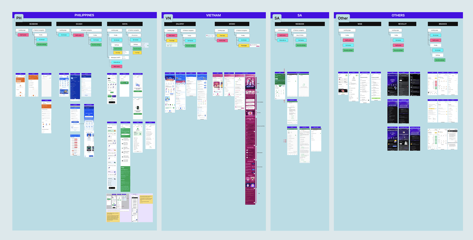
Competitor research
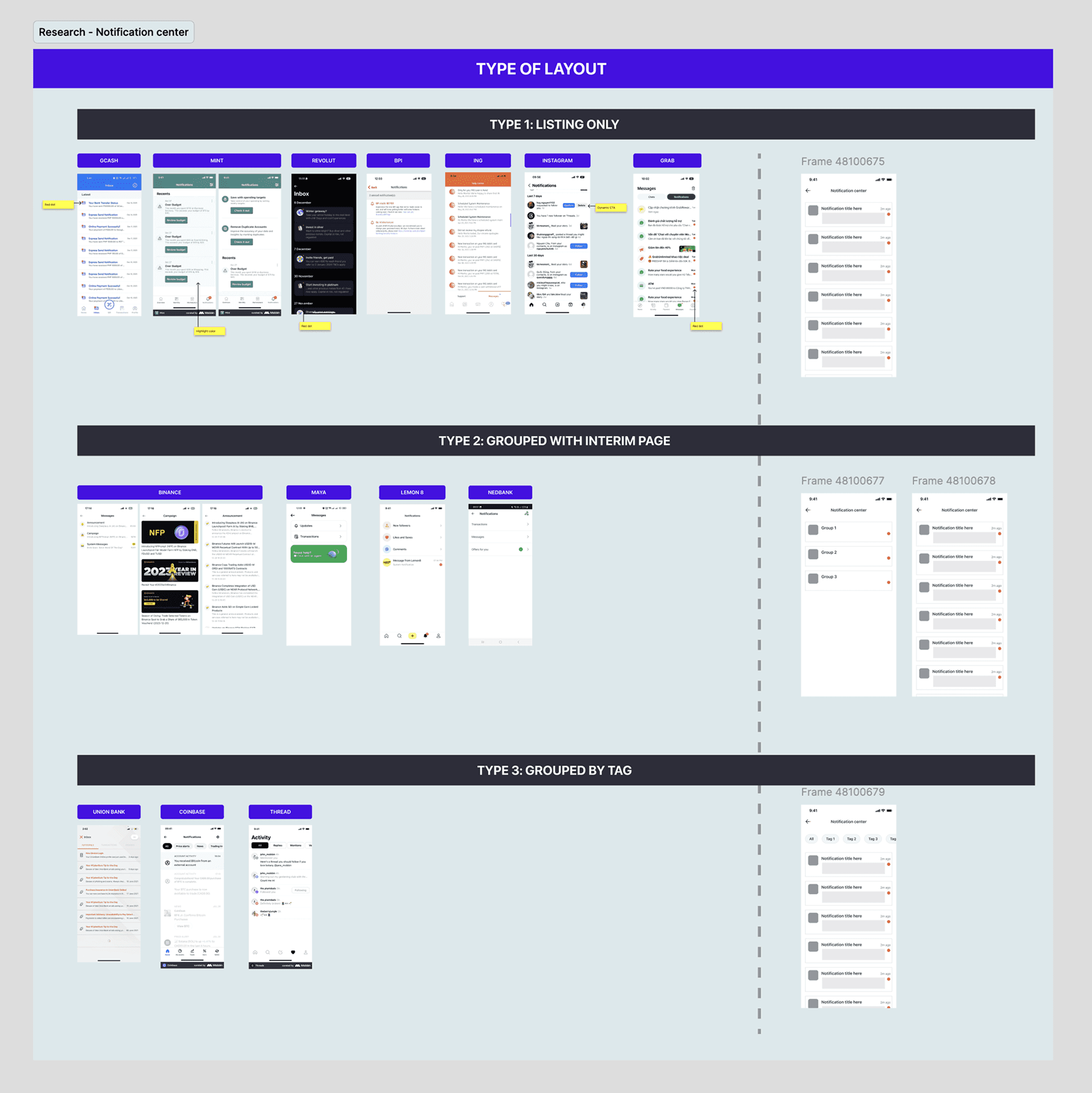
I analyzed several digital banking and fintech apps to understand how they organize and display notifications.
From the research, I identified key design patterns, such as inbox-style layouts or tabbed filters, and selected the most suitable direction for our app.
Overall structure
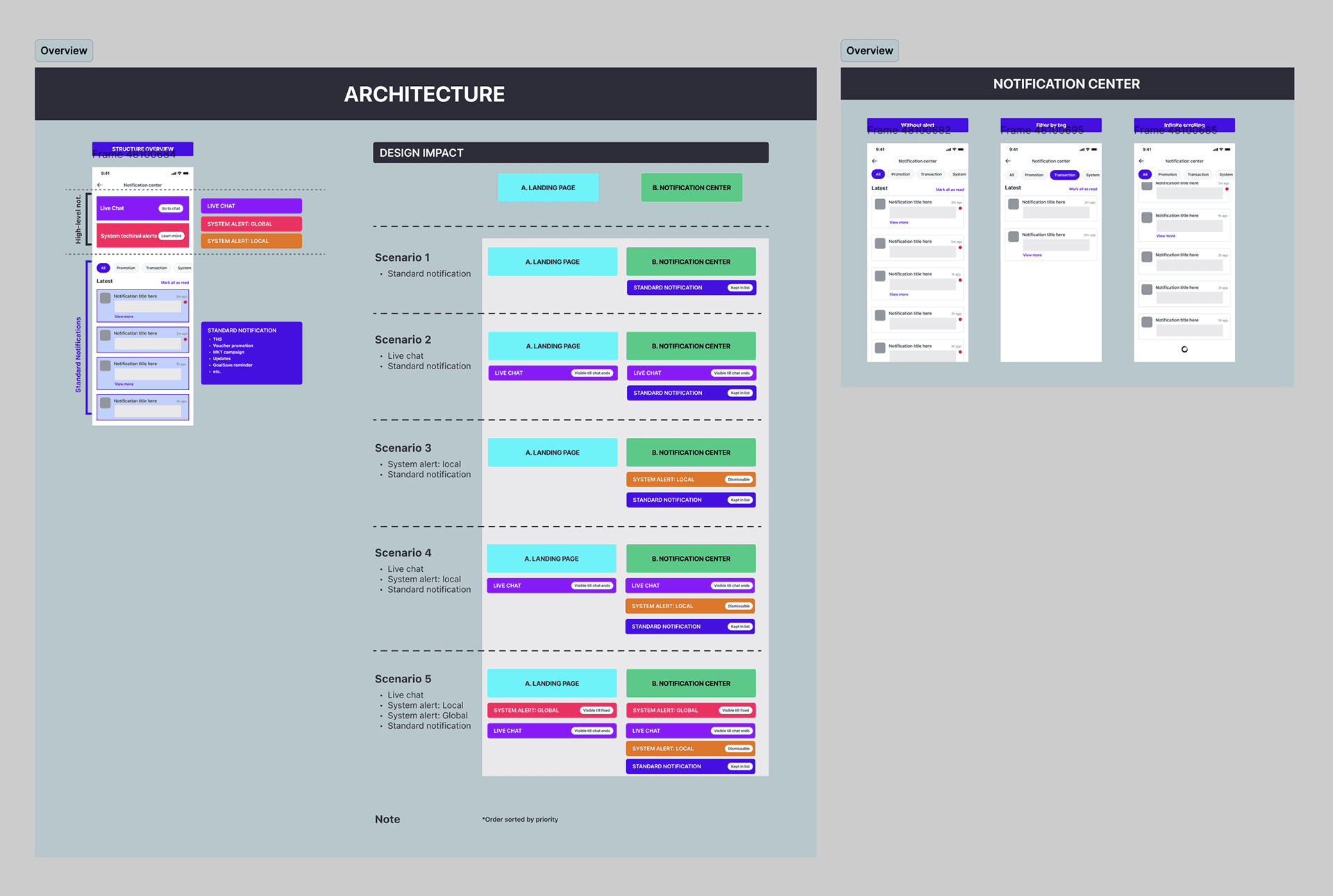
I defined a two-level structure:
High level notification: Which really requires the user's attention, or high impact information, such as Live chat/System Maintenance
Standard notification: for everyday updates such as Transfer or Bill payment.
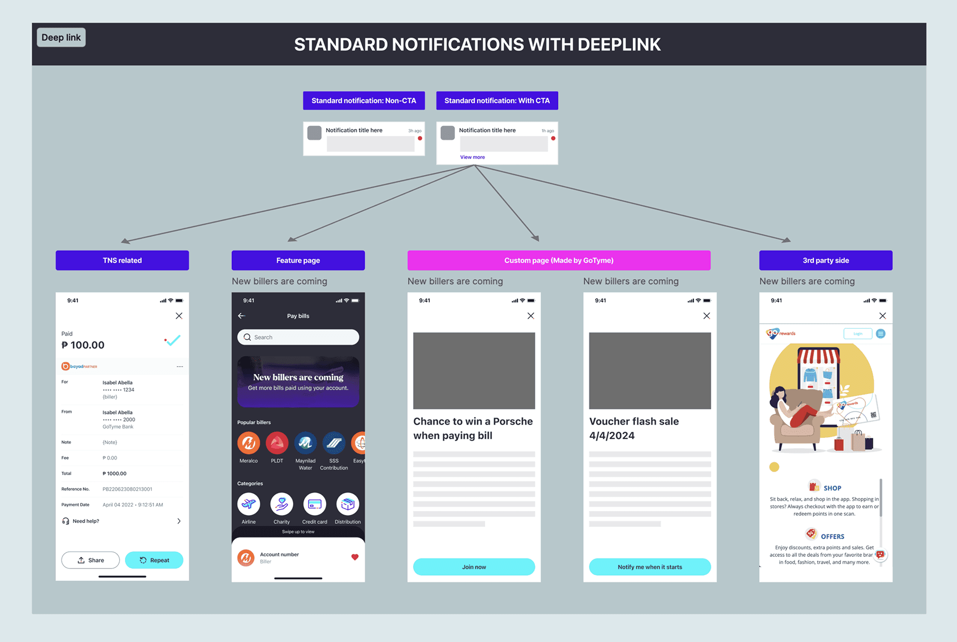
Deep link classification
As an extra layer of the project, I defined a clear deep link structure to support integration between the notification system and other parts of the GoTyme ecosystem. This framework allows operation teams and external partners to seamlessly connect their campaigns, user actions, and backend events directly into the Notification Center.
Configuration rules for internal teams
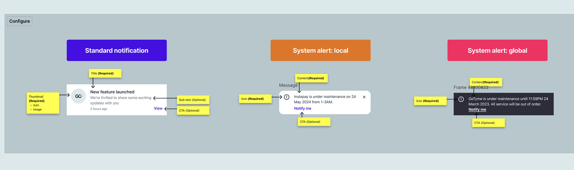
I created guidelines to standardize message setup across departments, such as:
Maximum text length and image ratio
Allowed icon types
Required fields
Scalability, aka "Multi-country" at TymeX
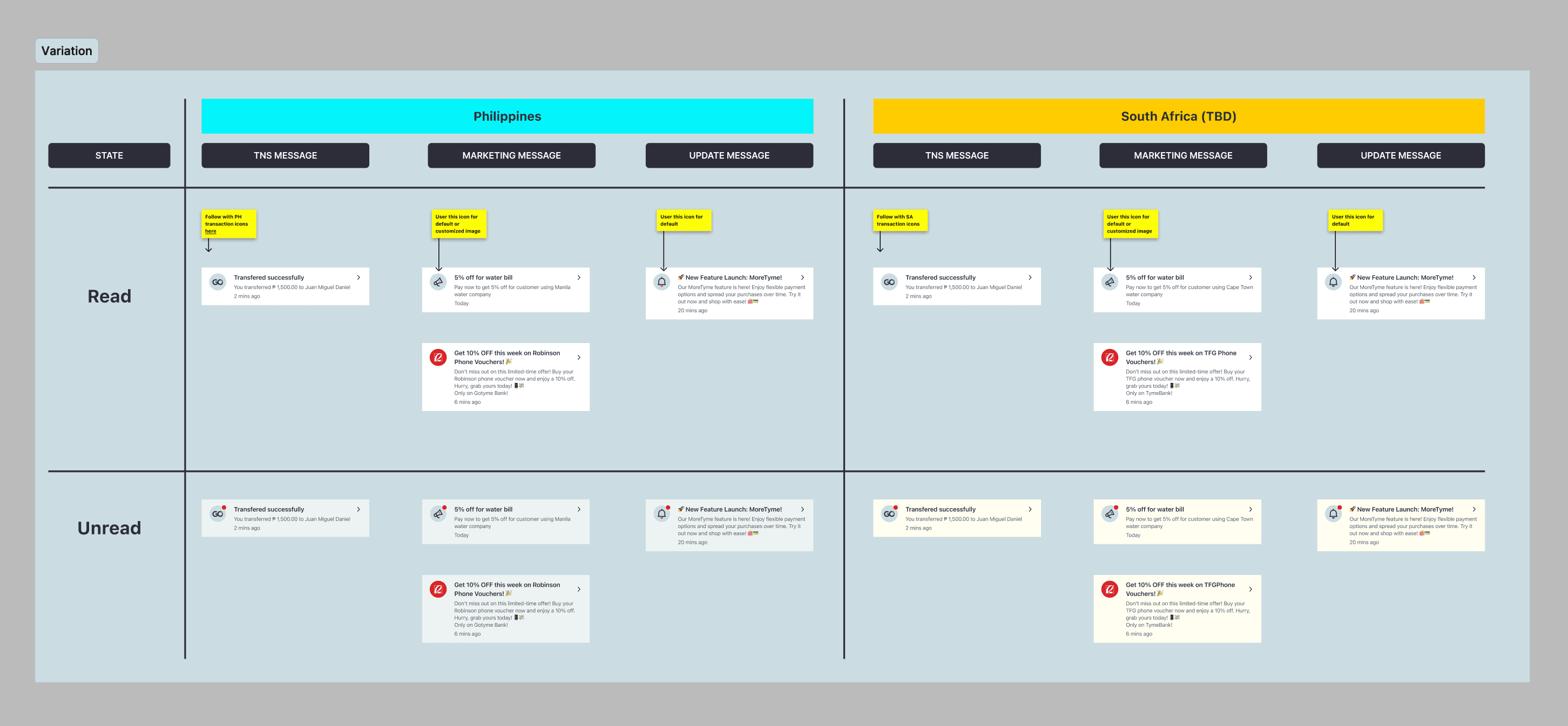
To ensure long-term flexibility, I also established a set of rules that allow the Notification Center to be easily reused and adapted across countries.
These rules cover layout behavior, localization, and configuration logic, enabling consistent scaling as GoTyme expands to new countries.
Roadmap

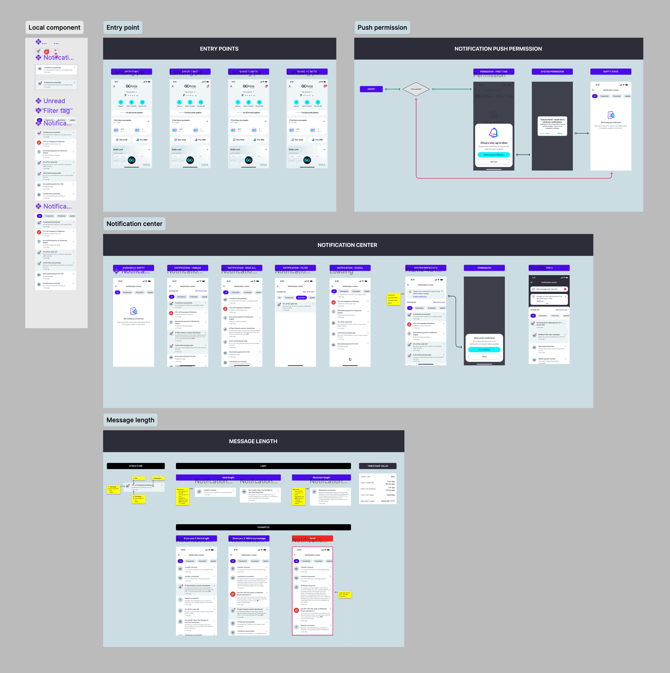
UI Delivery
Key takeaways
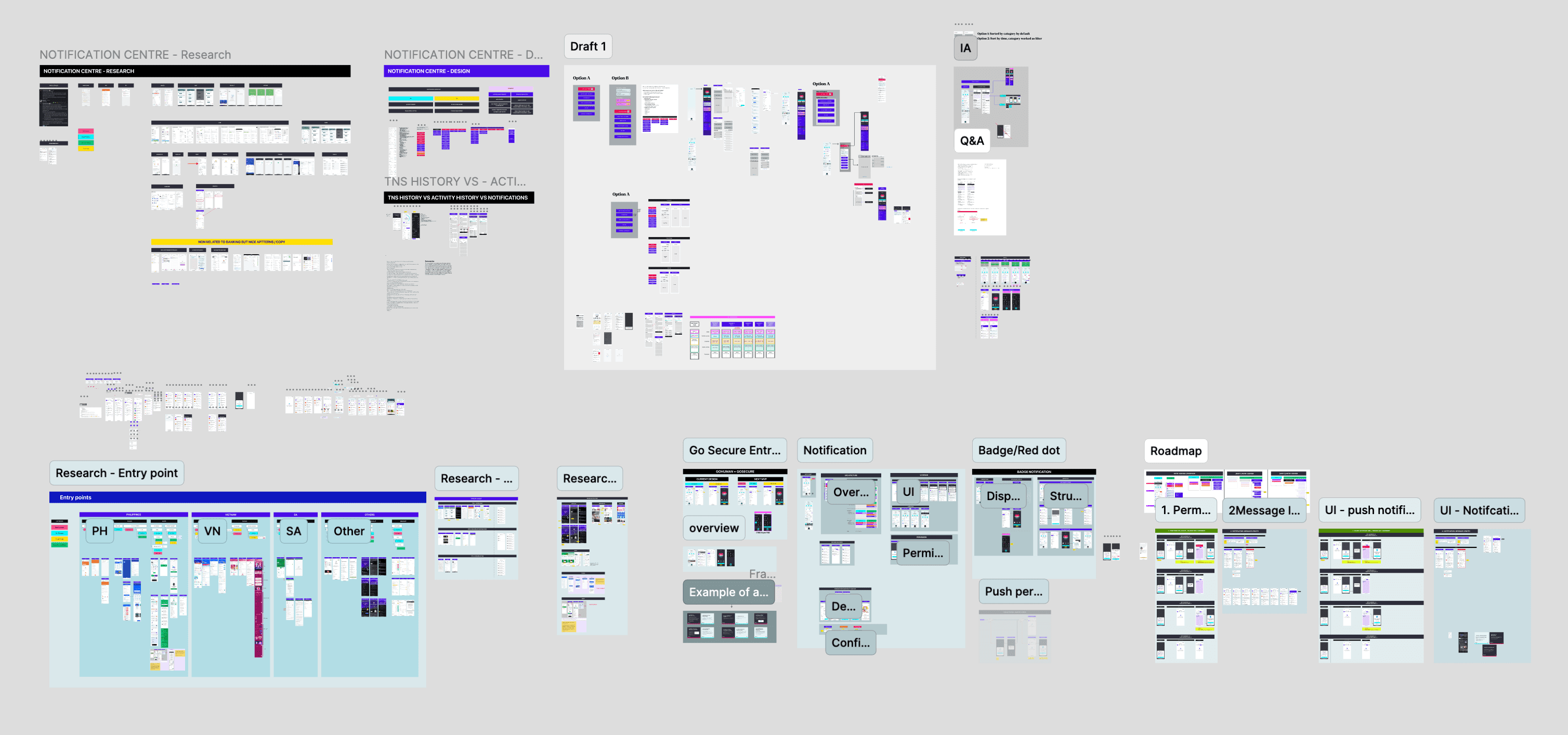
This project went beyond designing interfaces, it was about defining the system behind them.
The focus shifted from visual UI to the UX logic, underlying architecture, and cross-team workflow that make notifications meaningful and scalable.