2021
VinID x Techcombank

Background
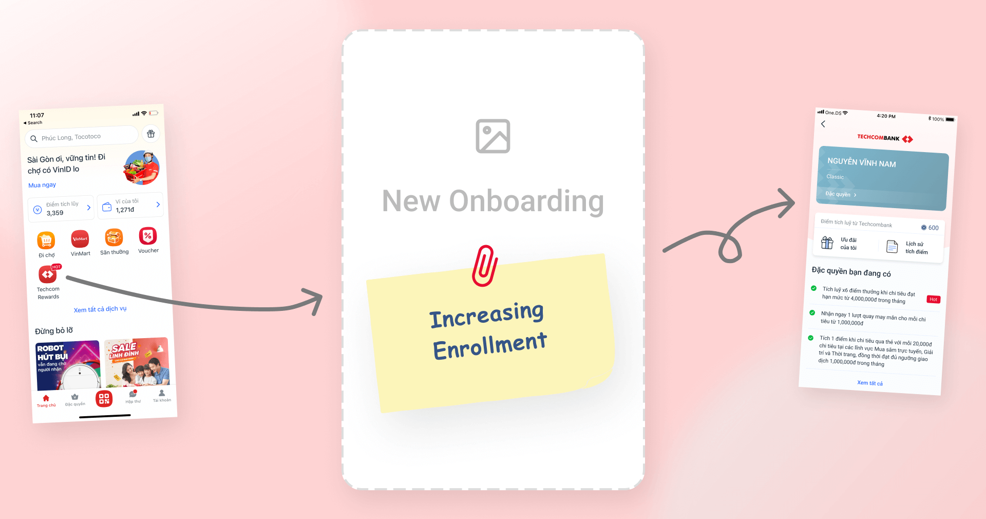
Techcombank Loyalty is an exclusive program for TCB Card holders, which offers vouchers and benefits based on their card tier. The main goal is to increase the stickiness with user and engage them with more credit services. My objective in this project was improving the metrics in this onboarding flow.
Core problem
The onboarding flow was lengthy and failed to engage users effectively, resulting in low registration completion. Additionally, the instructional content was overly complex and confusing, causing users to make errors and abandon the process.
Design progress
Evaluate the previous version
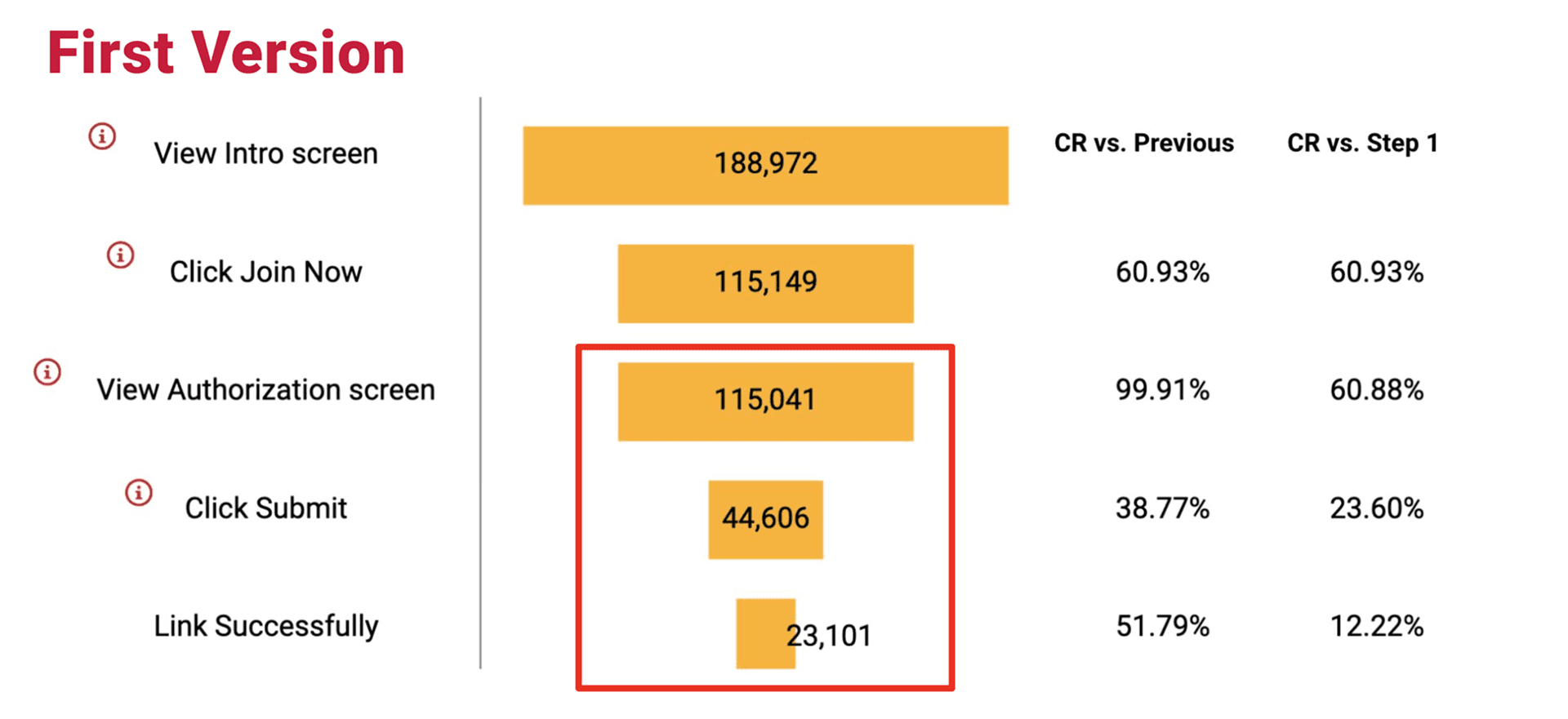
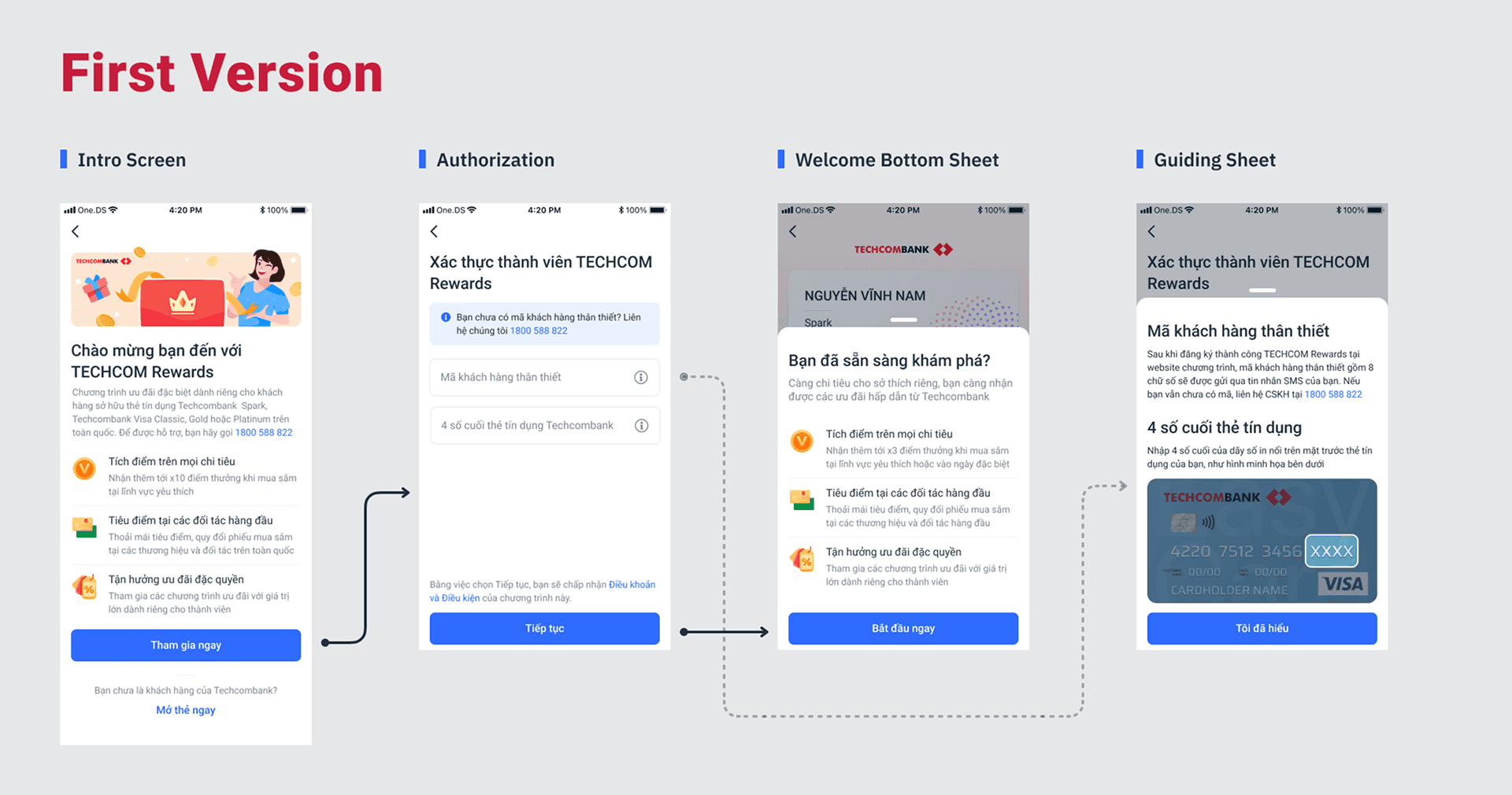
After checking the previous version, here are two things I first looked at to see what I can improve:
Onboarding funnel
Feedbacks from Customer support team
As you can see the final CR is around 12% and mostly dropped at authorization step. Combine with the feedbacks we collected here are some issues that I found:
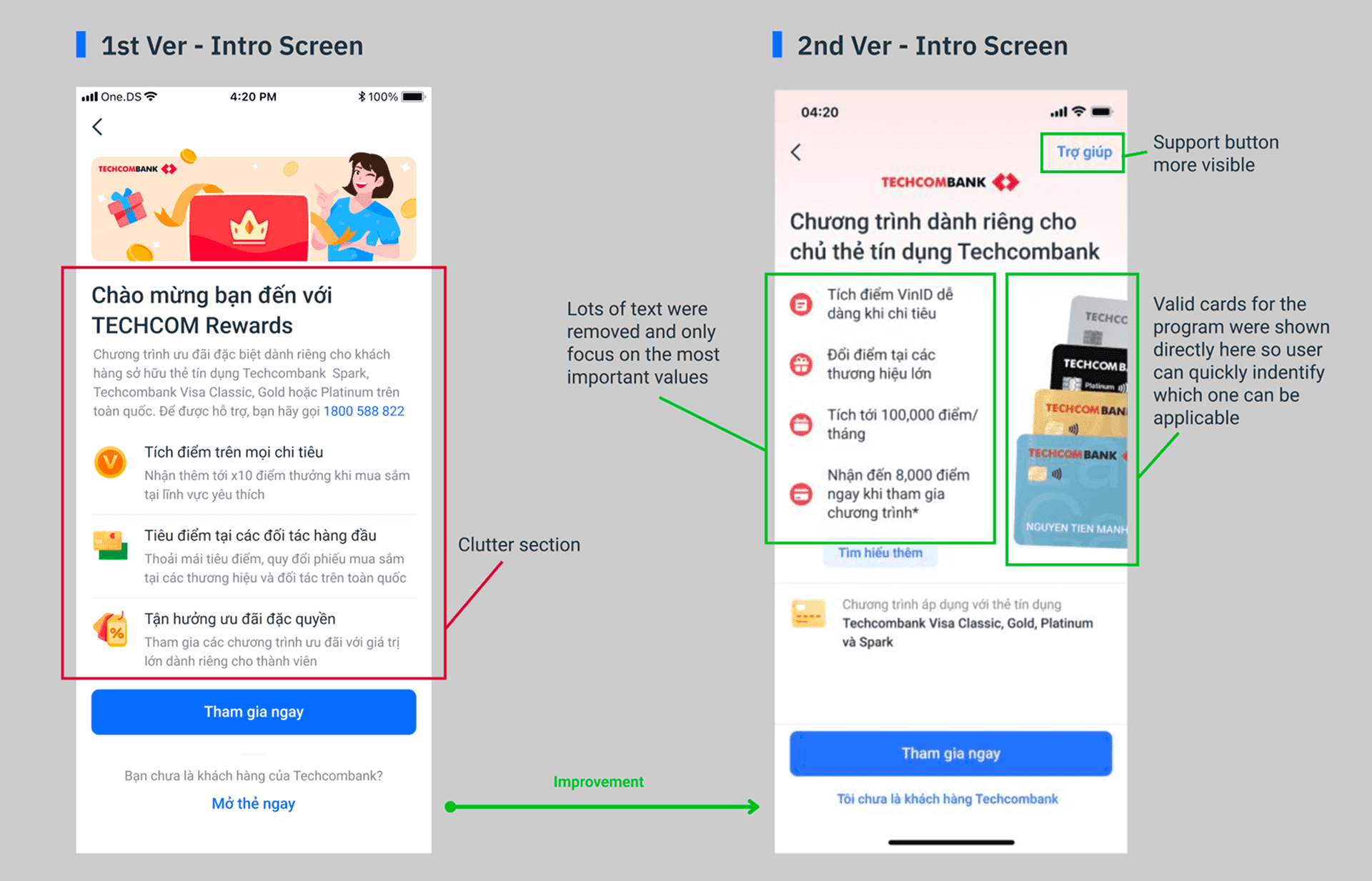
Too many text in the intro screen
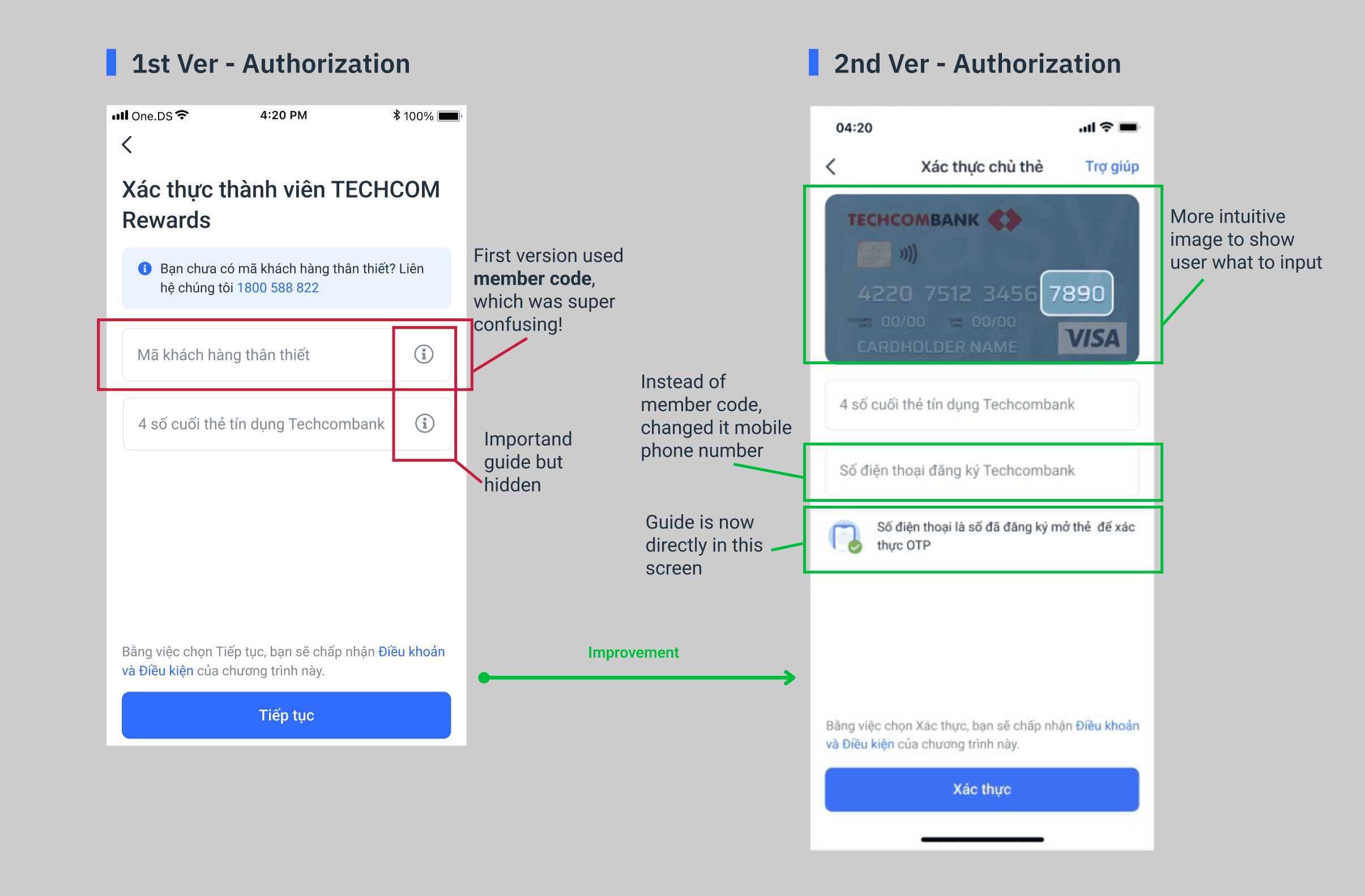
A lot of user didn't know what to input from their card
Many invalid cards were submitted
Terms and conditions were not clear
Improvement
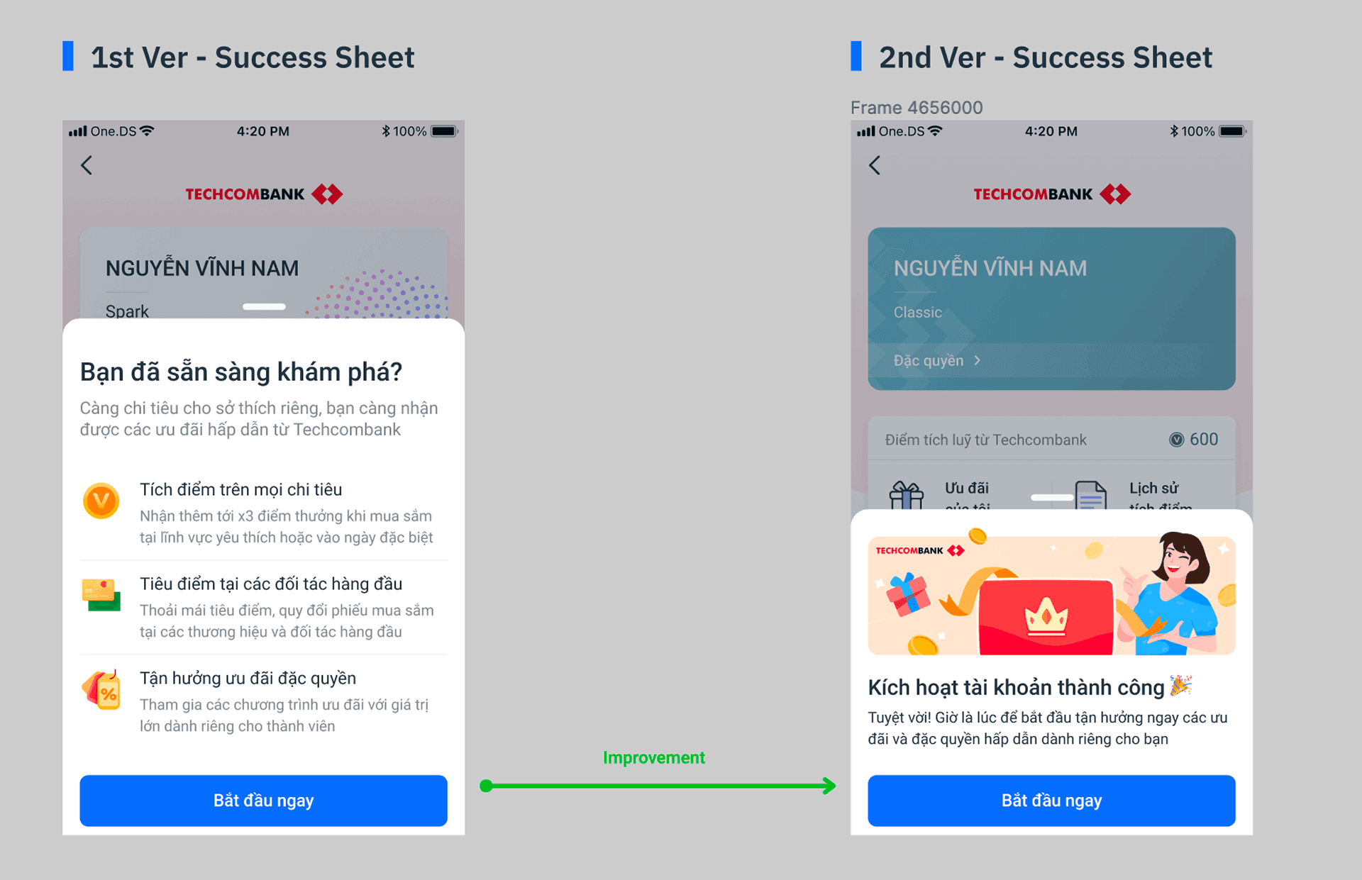
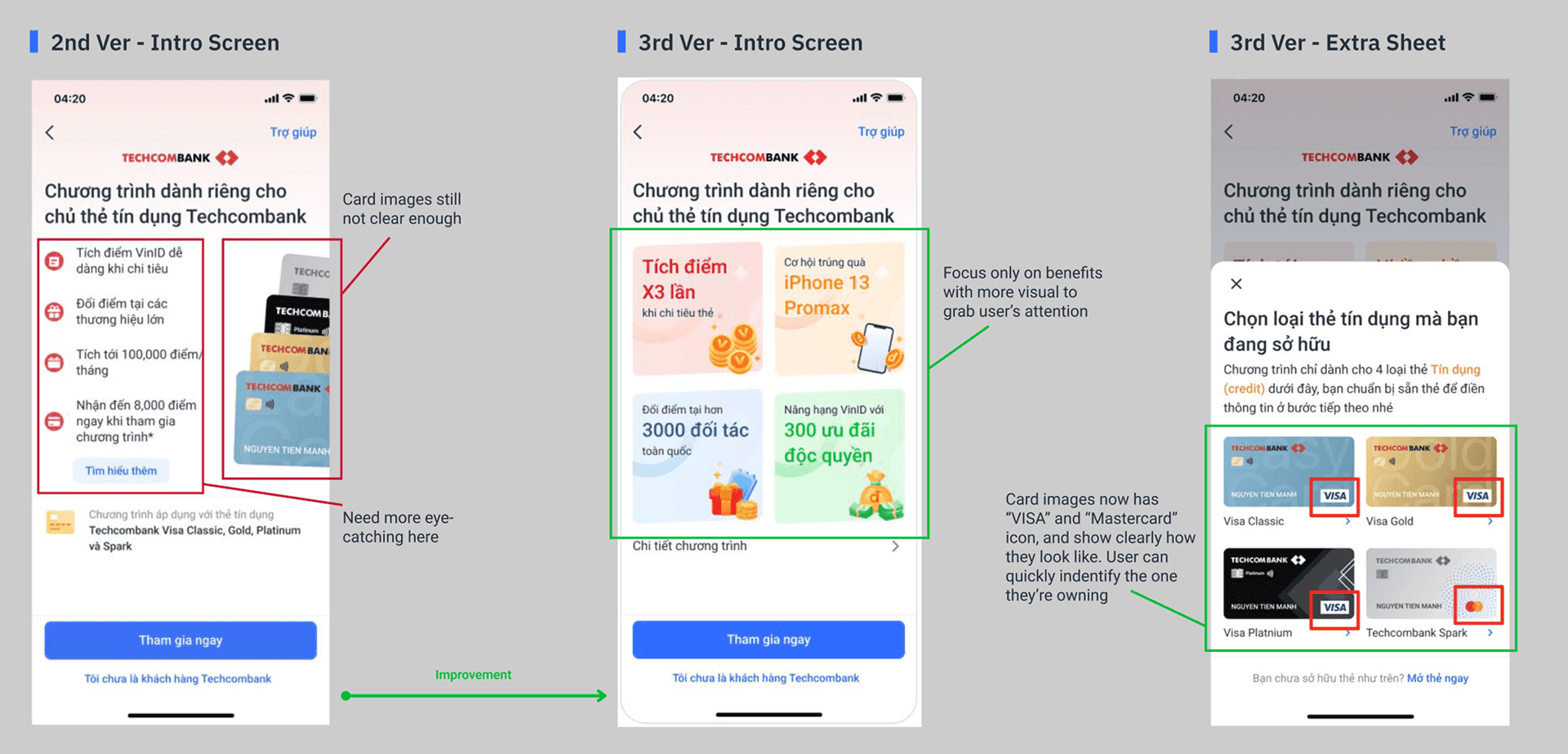
After defining the problems, I made some updates for the onboarding flow. As for the Intro screen, the main mission is to grab attention ASAP. So I tried to make it lean and focus only important things.
Measurement
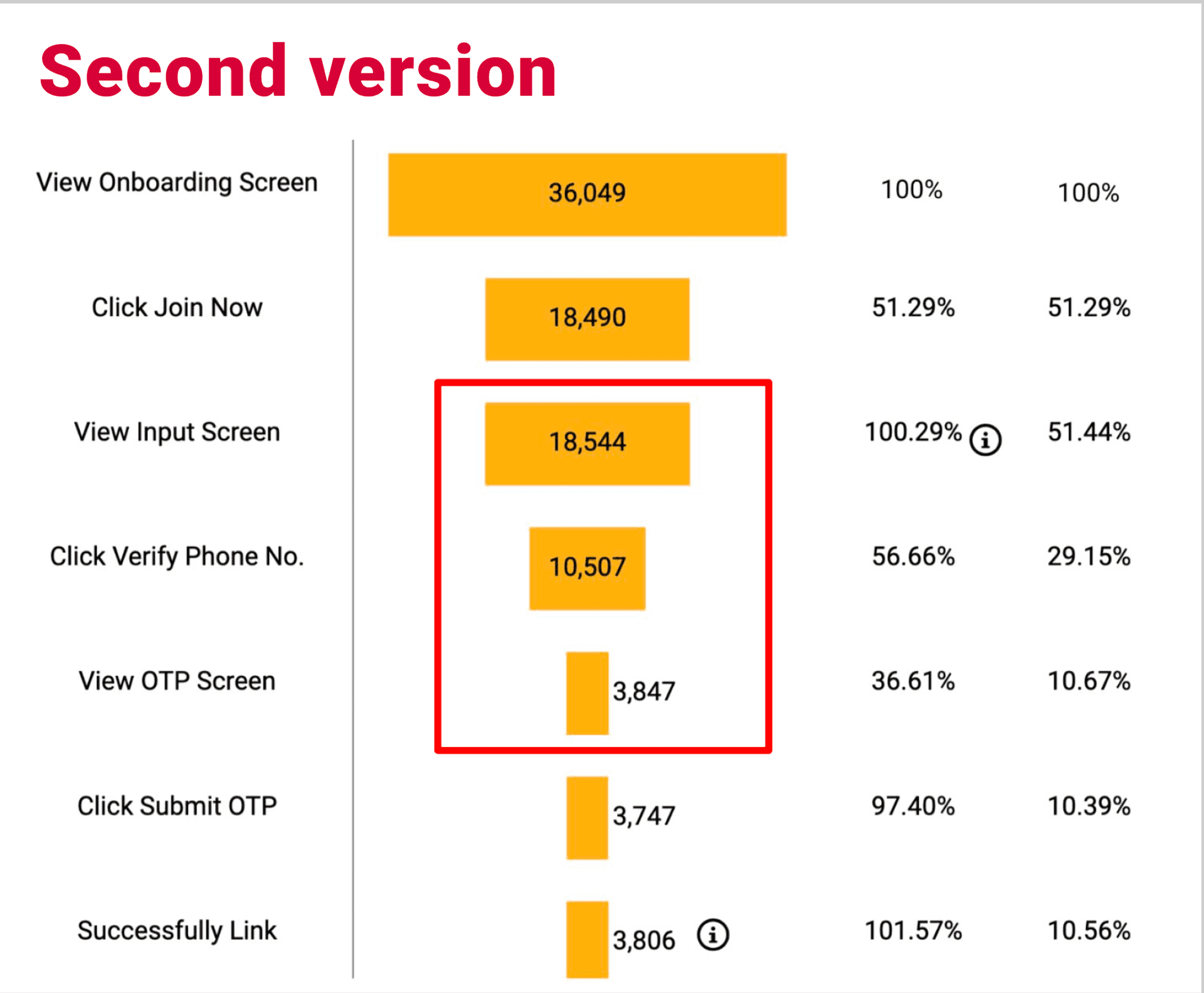
After the improvement, the new onboarding version was rolled out for 1 month (Oct 2021). The CR in Authorization actually increased, from 38.77% to 56.66%. And yes there was less feedback about user don't know what to input. But seems like the successful rate is still quite low, even lower than the previous version about ~2%. That's why we decided to make one more improvement.
Define problems… Again
Like previous time, I analyze the onboarding flow again and combine with feedbacks. This time we also had a small survey conducted by Techcombank. Which actually gave us very interesting insights.
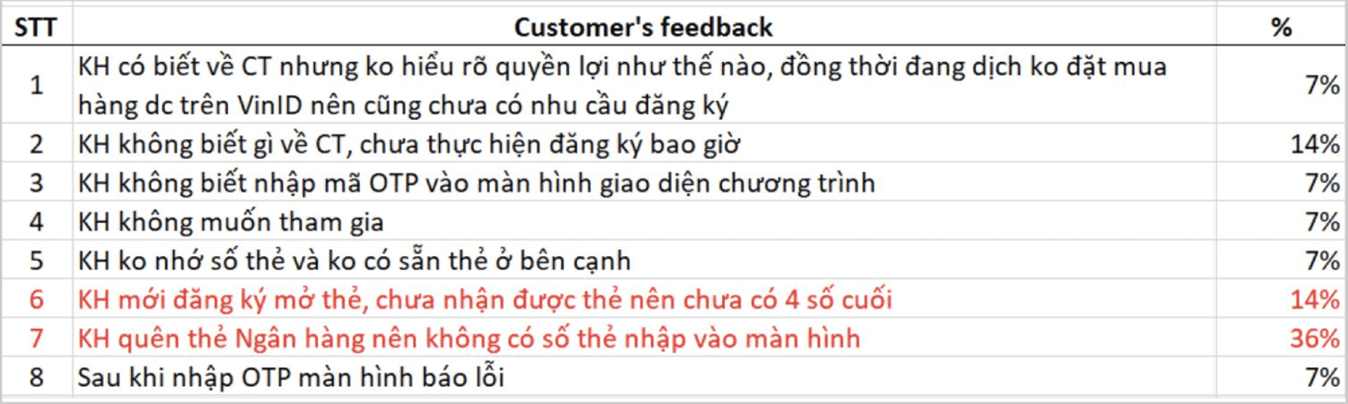
So here are the main issues we discovered:
People actually missed the "VISA" part, which led to invalid card
The card shown on screen still not clear enough
Many people forget how their card looks like
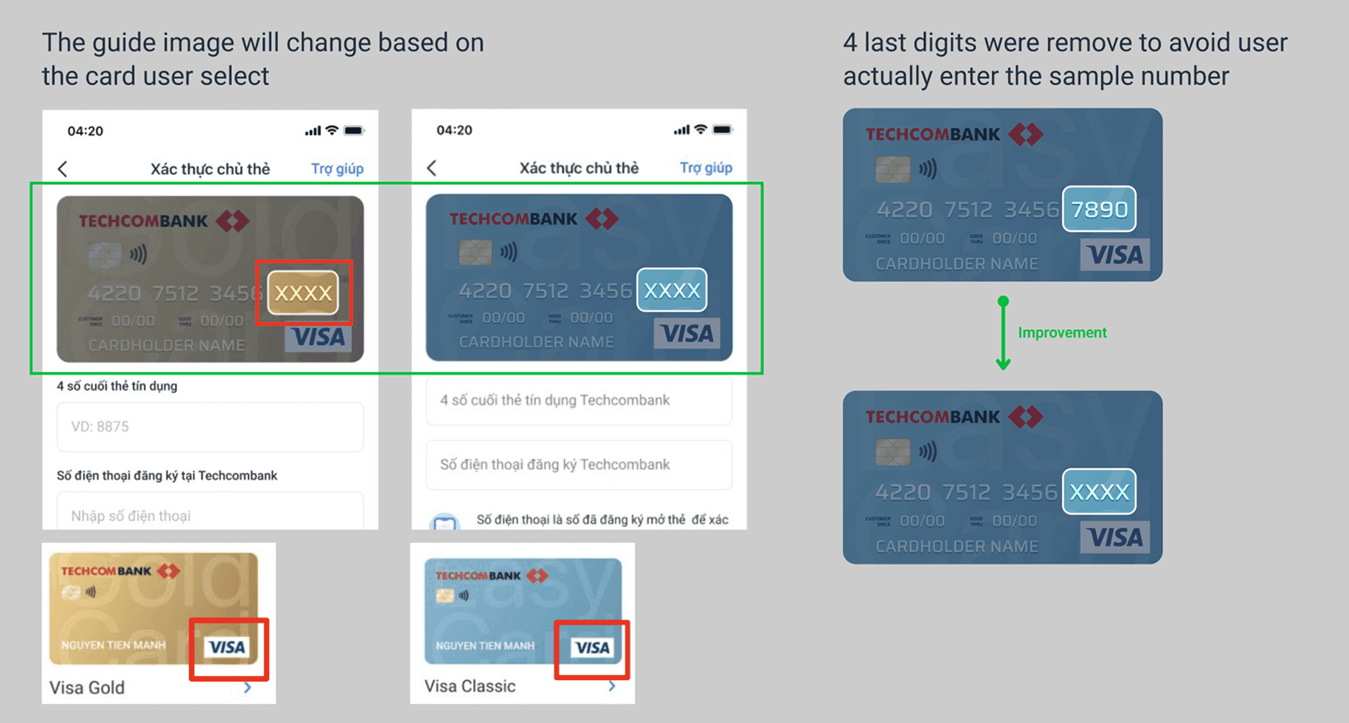
In the Authorization screen, people actually entered the the sample digits in the guide image.
I also followed up with Marketing team to redesign the program's values.
Improvement… Again
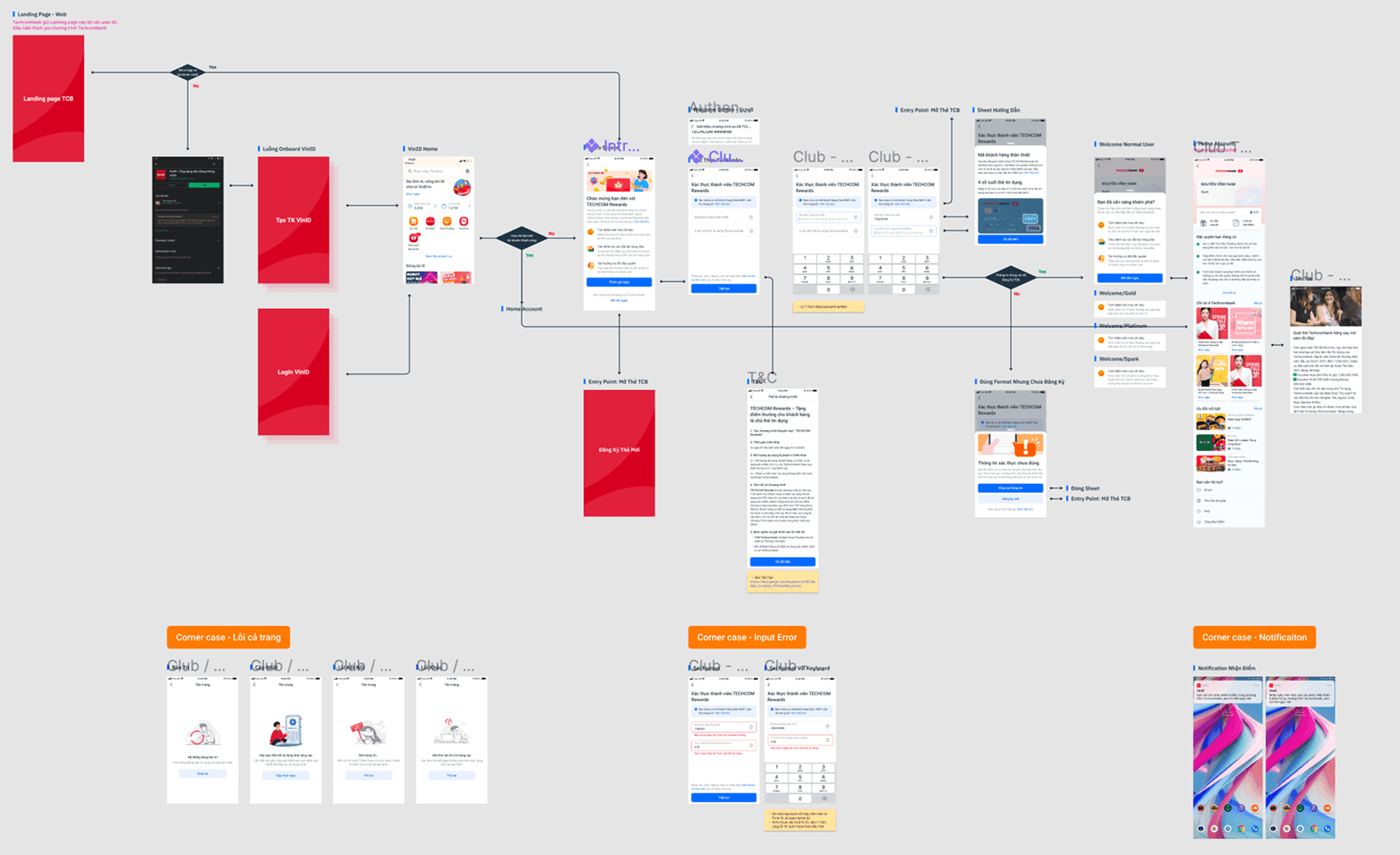
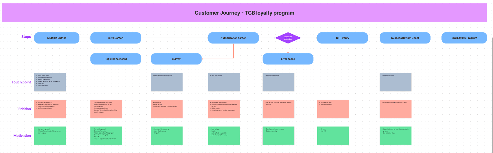
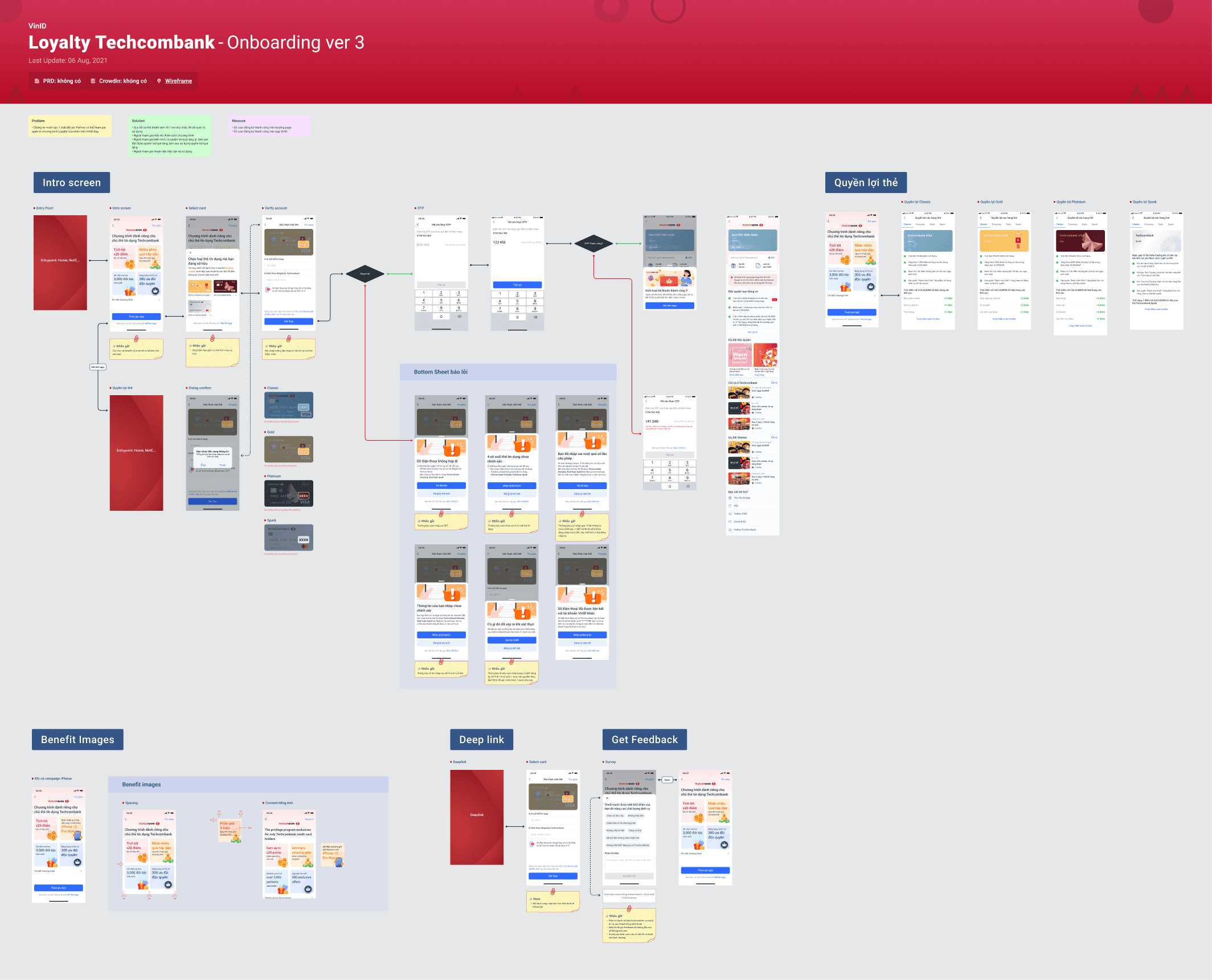
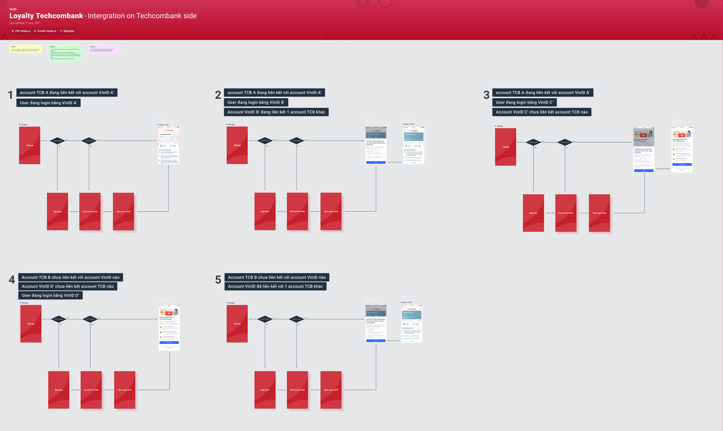
This time I created a CJM to have a better overview of the onboarding flow. Then I can base on that to come up with solution.
FinalDesign_final_real_03.fig
Results and Impact
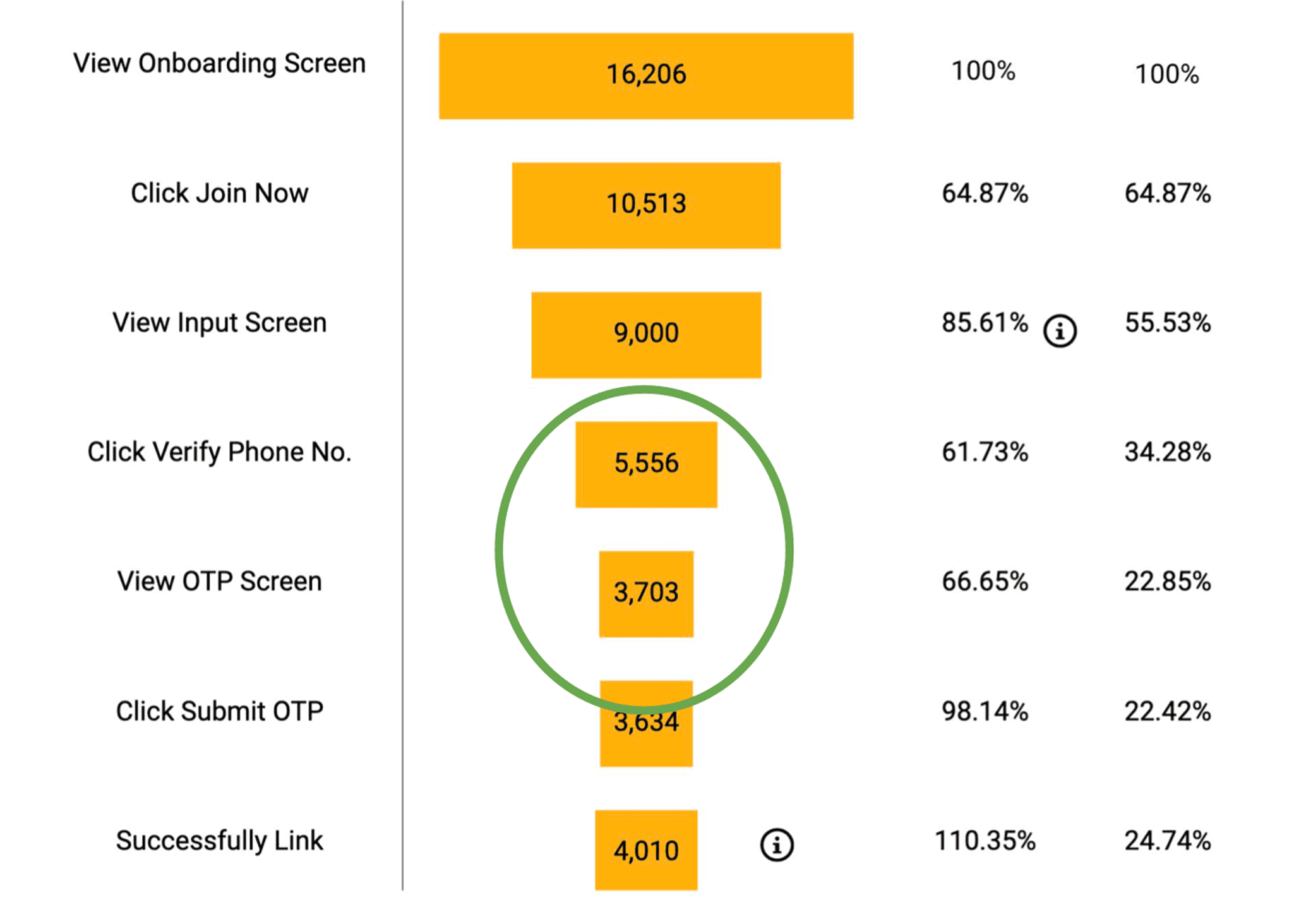
The result is pretty much better, espcially for these two important metrics:
CR in input step: The extra sheet seem worked, the rate was increased to 66%. The feedbacks is also reduced.
CR for successful join the program: from 10.56% to 24.7%